UI Simplicity vs. Complexity: Why Minimalism is the Aesthetic of Profit
By Ahmed Elsayed on January 27, 2026
UI Simplicity vs. Complexity: Why Minimalism is the Aesthetic of Profit
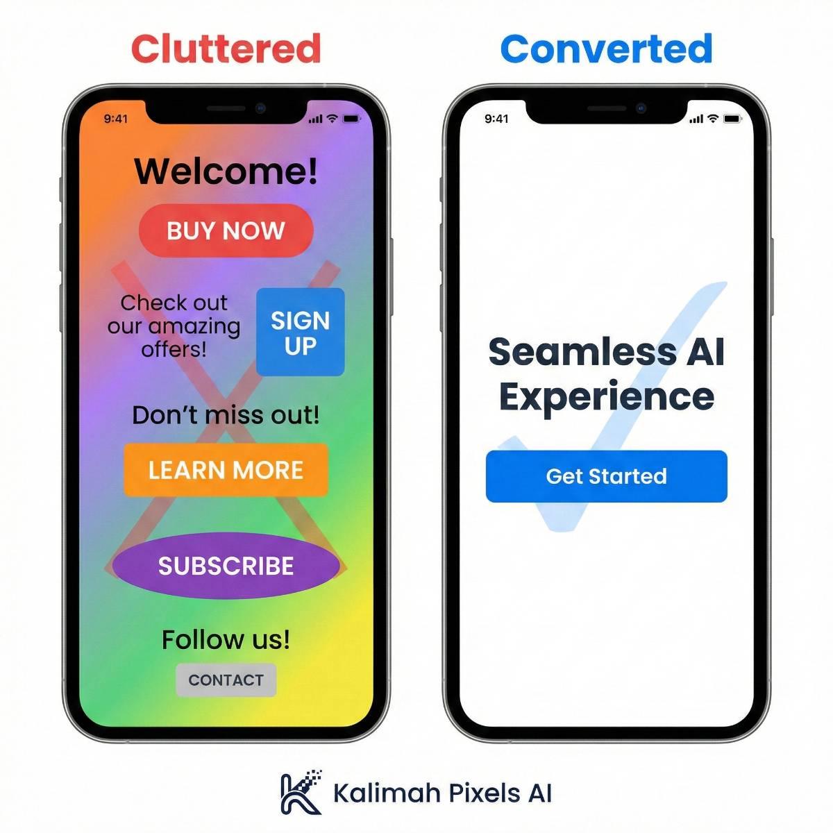
In the startup ecosystem, there is a dangerous misconception that "More is Better." More features, more colors, more buttons. But the data tells a very different story.
At Kalimah Pixels AI, we believe that great design is design you don't even notice. When an app is simple and intuitive, the user focuses on the value you provide, not on struggling with the interface.
Why Minimalism Always Wins
1. Speed is King
Every extra element on your UI (a heavy image, a complex icon, a gradient background) requires extra code and load time.
- The Fact: 53% of mobile users leave a site if it takes longer than 3 seconds to load.
- The Solution: Minimalist design means cleaner code and lightning-fast performance.
2. Reducing Cognitive Load
Your user's brain has limited processing power. When you present them with 10 options, they experience "Analysis Paralysis." We use Whitespace not just because it looks "modern," but because it forces the user's eye to travel directly to the most important element: the "Buy" or "Sign Up" button.
3. Trust and Credibility
Have you noticed that major fintech companies and tech giants (like Stripe or Apple) rely on stark, simple designs? Clutter suggests chaos and lack of security. Simplicity, High Contrast (like our Slate & Blue palette), and clear typography signal professionalism and safety.
How We Apply This in Our Hybrid Model
When we build your 24-Hour Prototype, we don't waste time on decoration.
- We define the primary goal of the app.
- We ruthlessly remove any element that doesn't serve that goal.
- We use Generative AI to render sleek, high-fidelity interfaces that focus on content.
The Bottom Line: Don't pay to complicate your customers' lives. Pay to simplify them. Simplicity sells.